
Six steps for writing meaningful alt text
Alternative text (alt text) isn’t just a technical detail to be handled by your developer. Alt text makes images accessible to people who use screen readers, supports inclusive design, and even boosts SEO. In health communications, leaving it out can mean someone misses critical information. Adding meaningful alt text is a small step with a big impact—and one of the easiest ways to reach as many people as possible.
What is alt text?
Alt text is a written description of an image that appears on a website, in social media, in an email. It serves several purposes:
Accessibility: alt text is read by a screen reader so that the user can understand the purpose of the image.
User experience: if an image fails to load due to slow internet or technical issues, or if the reader has images turned off, the alt text provides context for what was supposed to be there.
SEO benefits: search engines rely on alt text to understand and index images, improving a website’s search visibility.
The problem when alt text is missing
When alt text is missing, it creates real barriers—especially in health, where information needs to be clear, accurate, and accessible to everyone. For people who use screen readers, an image without a description means they are missing important information. That might mean not having access to infographics that help people understand conditions or treatments, or not having access to health data.
Apart from being frustrating—there are risks that person may skip or delay treatment. Already in our Australian healthcare system, 60-95% of health information is too complex for people and 19-59% of patients make errors in taking medication. There is work to be done to make health information easier to understand. But let’s also make sure everyone can access the health information in the first place.
How to write meaningful alt text
Not all alt text is created equal; clarity matters. A vague or generic label can be just as unhelpful as not having any label. Good alt text helps people understand what matters in the image and why it’s there.
Here are some guidelines for writing good alt text:
1. Describe the purpose of the image
Think about the role the image is playing and describe that, rather than describing every detail about what is in the image.
Bad: “A woman sitting on a couch holding a prescription bottle in her hand with a worried look on her face, next to a coffee table with a glass of water.”
Good: “A patient checking medication instructions, highlighting the importance of clear health communication.”
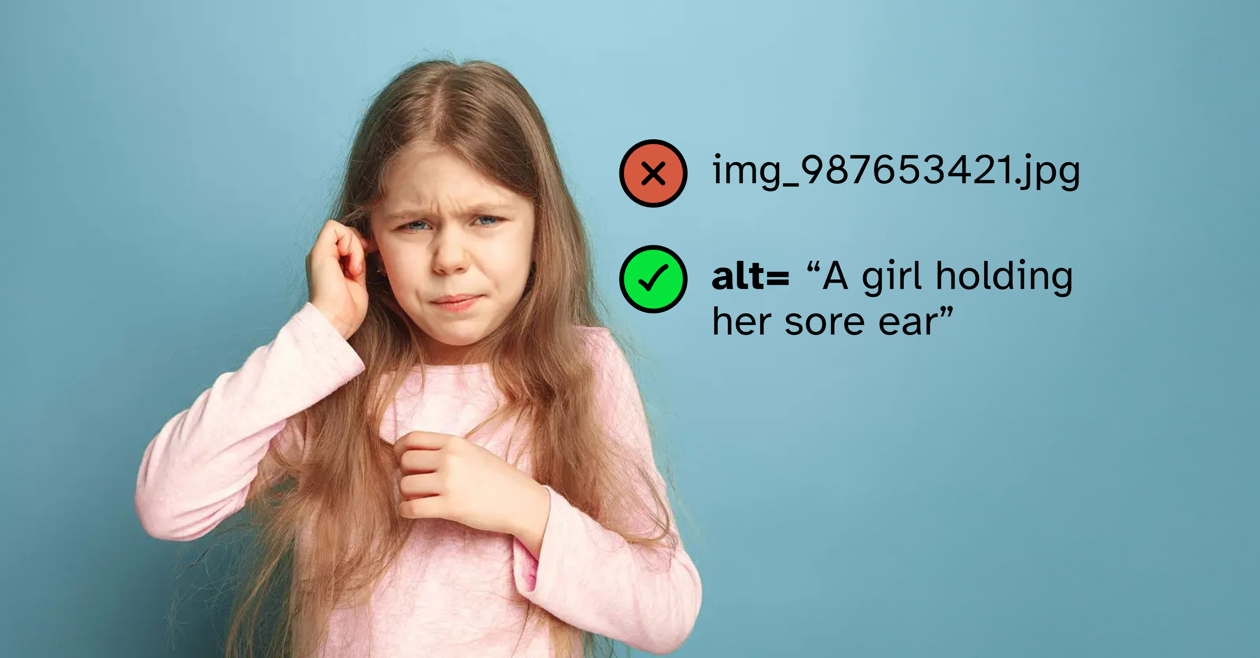
2. Keep it simple
Just enough explanation for the reader to understand. More complex info graphics or charts need a longer description.

Credit: Verywell / Jessica Olah
Bad: “An infographic with 6 illustrations for each of the risk factors for heart disease. Bottles for alcohol, blood pressure, blood monitor for diabetes, a sofa chair for lack of exercise, a clogged artery for high cholesterol and a cigarette for smoking.”
Good: “Infographic summarising key risk factors for heart disease, including alcohol, blood pressure, diabetes, lack of exercise, high cholesterol and smoking.”
3. Write in plain English
Alt text can include medical or condition-specific language where appropriate—but don’t add keywords only for SEO purposes.

Credit: The Guardian / Alamy
Bad: “Patient undergoing percutaneous coronary intervention during acute myocardial infarction.”
Good: “Patient receiving emergency treatment for a heart attack.”
4. Skip “image of” or “photo showing”
Screen readers already announce it’s an image. Get straight to the point. Describe the type of image if it adds to the meaning of the image.

Make it stand out
Bad: “Image of a doctor giving a vaccine to a young girl.”
Good: “A doctor giving a vaccine to a young girl.”
5. Don’t write alt text for decorative images
Think about whether it adds to the meaning of the text or whether it would just be clutter for a screen reader user. If the image is just decorative, such as a pattern or an illustration used to break up paragraphs of text, mark it so it is skipped by the screen reader.
On the health symptom checker page below, the illustration is unnecessary for the screen reader to understand what the page is about. This image should be marked as alt="".

Screen shot of the Healthdirect Symptom Checker tool
6. It’s a job for the content team
Writing alt text according to the guidelines above, is a task that requires careful thought. As you prepare your health information and imagery, this is the time to write the alt text. Don’t leave it as an afterthought, for a developer to add in, who might not understand the audience and the purpose of the content.
Making health equitable
Adding alt text to images is a simple yet powerful step toward making digital content more inclusive. It ensures that as many users as possible can fully engage with the information presented online.
It also helps build trust for the digital service. It says that the service is serious about equitable health, ensuring access for everyone.
Beyond accessibility, it improves SEO and user experience, making it a win-win for content creators and audiences alike. The next time you upload an image, take a moment to add meaningful alt text. It’s a small effort that makes a big impact.