
Simpler and seamless workflow for scheduling staff
Health Metrics eCase platform
Services provided
Task analysis
Workflow design
Prototyping
User testing
User experience (UX) design
Accessibility
User interface (UI) design
Background
eCase is Australia’s leading digital solution for the clinical, financial and operational needs of aged care, retirement living and disability services. Healthmetrics engaged us to re-design the scheduling function of their platform. Scheduling supports various roles including Rosterers, Regional Managers, Case Managers, and Field Workers, who need to manage schedules, allocate resources, and ensure operational efficiency.

Screens show mock data

The challenge
The current platform had some disjointed workflows as it had grown over time. The job to do was to understand how schedulers needed to complete tasks and design accordingly. There was also a huge amount of data to cater for, to display clearly and logically in a single view.

Screens show mock data
What we did
Interviewed stakeholders to learn about what’s not working and what works well in competitor products
Created key user stories to define the rostering and allocating tasks
Design the to-be workflows and wireframes to workshop with product managers
Prioritised data points to decide what to display and what to omit for simpler screens
Crafted the elements and views for each step in workflows, including drag and drop and slide out task windows
User feedback sessions to improve design, interaction and micro copy.
The result
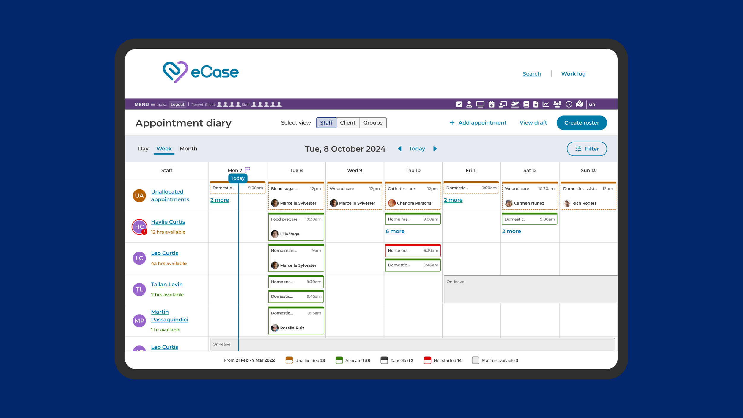
The project successfully delivered a re-designed eCase scheduling system, which now combines diary, grid, and timeline views with improved filtering capabilities and various zoom levels, creating a more organized and less overwhelming interface.
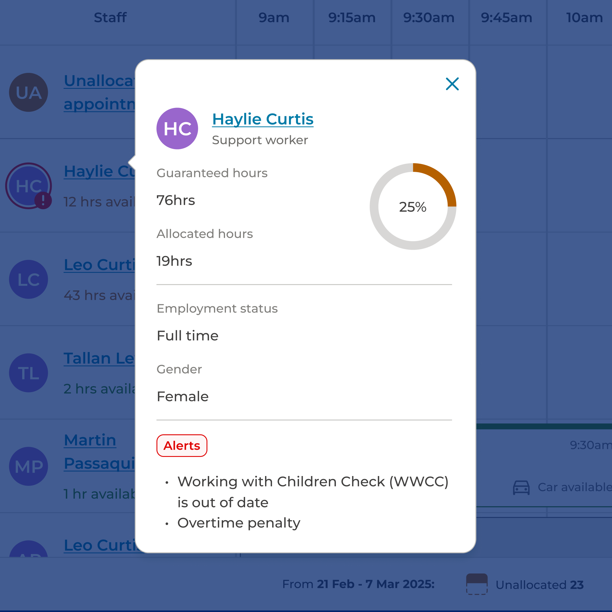
Users will benefit from streamlined processes for auto-populating rosters and manual allocation of staff to appointments via drag-and-drop functionality. Crucially, the system now supports bulk moving of staff or appointments, so when staff or clients are sick, it takes a few steps to resolve, rather than many repetitive steps. The design also includes nudges to guide the scheduler towards successful allocation of staff and alerts to signal conflicts in allocations.
These improvements directly addressed friction points, culminating in a more efficient, intuitive, and reliable scheduling process for users.
“Working with the Made Simpler team has been an excellent experience. I was looking for expertise in designing complex scheduling functionality for our software. They ensured there was clear understanding of user workflows and business needs. They collaborated closely with us, offered practical solutions, and delivered designs that made scheduling more intuitive and efficient for our users.”