
Boosting design capability with a new design system
Healthdirect Australia
Services provided
User experience (UX) design
User interface (UI) design
Accessibility
Design system
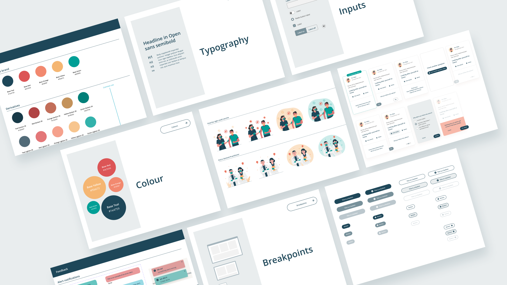
Background
Healthdirect did not have a design system for their national health information service, that was holistic and accessible to staff. This was preventing collaboration and fast prototyping and it was inefficient for developers.
What we did
Design of a new look and feel to revitalise the website and improve usability and accessibility.
Established consistent design patterns in a Figma component library to accelerate product development.
Synchronised with development teams’ code components to foster reuse and consistency.
“It’s satisfying to give staff the tools to easily prototype and enable more staff to be involved in the design conversation.”